Different types of graphs
There are different kinds of graphs.
To understand what a graph shows you, you need to understand the following phrases:
A comparison is made when you analyse things to see similarities and differences.
A contrast is the difference between two sets of information. Usually used when making a comparison to show differences.
A proportion is a part or share. It corresponds to other parts or shares of a whole. Usually the basis is 100 %, and the different proportions are added up to make 100% in total.
A trend is a pattern that can help us to predict what may happen/develop in the future.
Development is a process of change or transformation.
A statistical spread is used to measure the central tendency (like a median) of data.
This might seem very mathematical.
Look at this list to learn more about graphs. You will find explanations for these phrases.
Bar chart
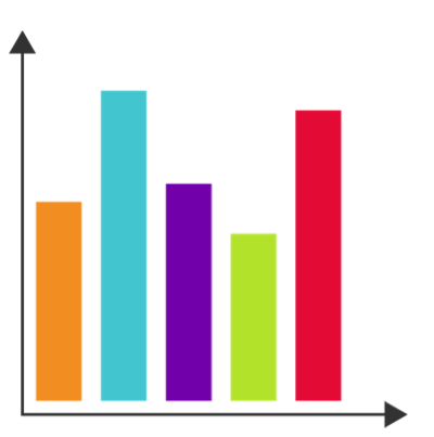 A bar chart is often used to compare values of items at a certain point of time. It uses rectangles (bars) to visualise information. It is used mostly to show proportions, trends, comparisons or contrasts.
Proportions: This bar chart could show the outcome of a vote in which five different parties have participated. The party represented by the blue bar won, closely followed by the party represented by the red bar. The least votes were given to the party represented by the green bar.
Contrast: It could also represent the number of sunny days during a five week holiday. Each bar would represent one week. So the chart shows that the second and the fifth week were the sunniest ones.
Comparison: The bar could also show how many students go to school on foot, by bike, bus, car etc.
Trend: It could show a development over five years, how the number of car users have changed.
Line chart
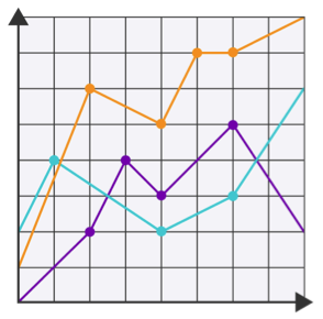 A Line chart uses lines to indicate values, usually over a period of time. Therefore it is mostly used to show trends or developments.
This line chart could show a development, e.g. how the use of three different kinds of social media have developed. The social media represented by the blue line has been well used in the beginning but soon was overtaken by the social media represented by the yellow line. It could also show a trend, i.e. how eating habits have changed over the last year. The yellow line could represent vegetarians.
Group bar chart
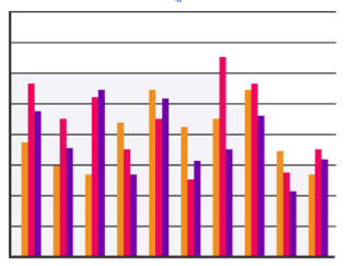
This kind of bar chart is like the bar chart 1, but adds a third characteristic (the different colored characteristics).
In our example the x-axis can represent different sports, the y-axis the number of people and the colored bars men, women and children.
Positive / Negative bar chart
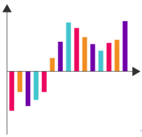 A positive / negative bar chart is used to show both positive and negative developments.
It can be used for a Comparison of positive and negative data, e.g. comparison of revenues and expenditures of a newly opened shop. In the first months there were more costs than incomes, but in the next few months it has changed and the shop owner started to make money.
Pie chart
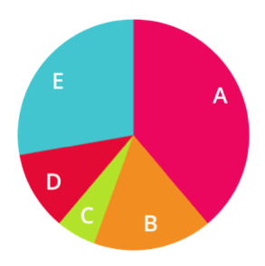 A pie chart is a proportional area chart, made of a circle which is divided into segments. Usually it shows relative sizes and compares one component to the whole set (100 %).
Relative sizes are a percentage, like a cake slice of the whole cake.
This chart could show the money a person spends in a months. Section A could represent money spend on rent, B could represent money spend on food, C could represent money spend on clothes, D could represent money saved and E could represent money spend on phone, media, sports and other.
Stacked bar chart
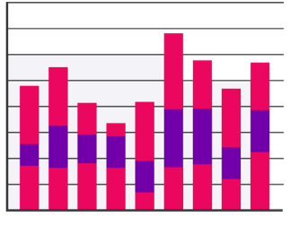 This kind of bar chart is another form of group bar chart, except that the bars are not stacked next to each other but rather added together into one bar. Therefore you can have specific data plus additional data added as well.
Proportion – For example it could show different people and how many apples (pink), bananas (violet) and oranges (pink 2) they eat. So it shows the overall consumption of fruit and the specific fruit as well.
It could show a comparison of average media use during weekdays, weekends, and holidays. The bars could represent 9 different months. The bottom of the bar could represent the average use during weekdays, the middle part could represent weekends and the top could represent holidays.
Contrast – Showing different countries and the degrees of summer and winter.
Area diagram
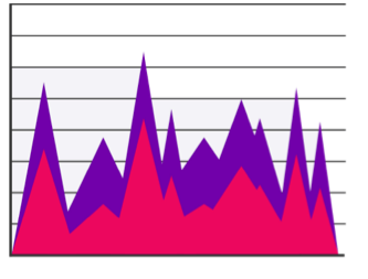 An Area diagram shows trends over time, not unlike a line chart.
This one could show trends shown over time; e.g. the amount of rain and snow on mountains. The pink area could represent the snow, the purple area could represent the rain.
Scatter diagram (x,y)
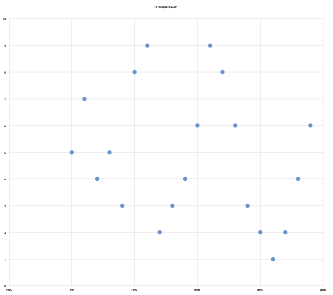 A scatter diagram is two or three dimensional. The density and direction of points shows the relationship between the variables. It is also known as scatter diagram, scatter graph or scatterplot. Most important areas of use are to show arithmetic average and correlation of data.
Our example could be to look for the average height of students. The y-axis shows the height of students, the x-axis represents the ages of students themselves. The scatter diagram has a function to find the average height of students at a specific age.
Surface diagram
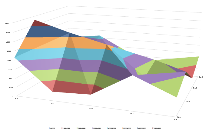 A surface diagram is a more complex area diagram, as three characteristics are possible. It is also mostly used to show trends over time. This diagram could show trends shown over time; e.g. how much rain fell over a course of time in different regions.
In this example the three characteristics could be:
- Rain in mm;
- Time;
- Different regions over the course of time in different regions.
Web diagram
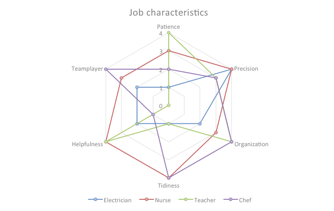 A web diagram is used for target-performance comparison.
This one could show a target-performance comparison’; e.g. What skills and characteristics do you need for a certain job? Here we look at the skills of patience, precision, organisation, tidiness, helpfulness and team player. The different jobs are represented by a colour. For example red could represent the skills you need as a nurse. In this case it shows that a nurse has high scores in most areas. Whereas the blue line shows that in this job precision is more important than the other skills. It could represent the skills of an electrician.
Bubble chart
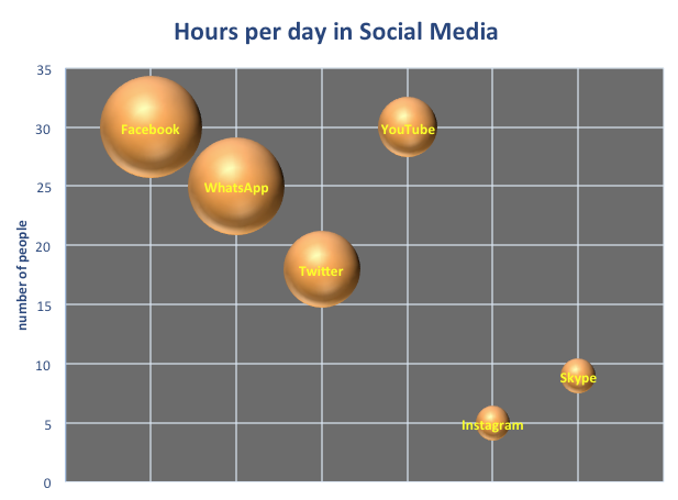 A bubble chart is a diagram which is labelled by bubbles. Additionally to the x-axis and y-axis, the size of the bubbles show a third characteristic.
This example shows how many hours per day people spend on social media. The y-axis represents the number of people who use the media. The x-axis stands for the media form (Facebook etc.) and the size of the bubble represents the hours the media is used.
Circle chart
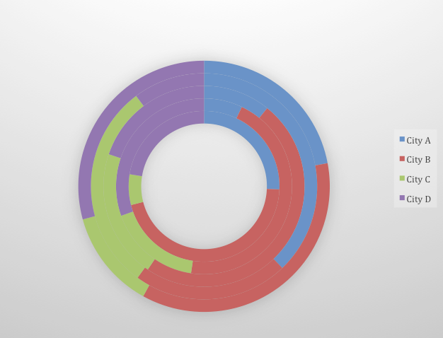 A circle chart can either be used like a pie chart or a third characteristic can be added to be shown in a circle chart, as more circles are possible.
It can be used to depict fractions (100%) and to make comparisons.
E.g. Theft (in %) in different cities in different years. The colours represent different cities, the circle rings the different rings and the coloured portions the percentage/amount of thefts.
Infographs
 An infographic (information graphic) is a representation of data in a graphic format designed to make the important information easily understandable at a glance.
It is used to show and create all kinds of graphs and meanings using data and your imagination. Depending on personal likes and ideas you can use pictures, colours, words or patterns.
This infographic is about creativity. It uses the size of words to show their importance. Also colour is used to draw our attention immediately to the words in dark blue. Using the map of the world immediately tells us that creativity is something common all over the world.
http://www.mindtools.com/pages/article/Charts_and_Diagrams.htm
In the following table you can find out quickly about when to use what type of graphs:
| Bar Chart 1 | Line Chart | Bar Chart 2 | Positive/ negative bar chart | Pie chart | Bar chart 3 | Area diagram | Scatter diagram | Surficial diagram | Web diagram | Bubble chart | Circle chart | |
| Proportions | x | x | ||||||||||
| Trends | x | x | x | x | x | |||||||
| Comparisons | x | x | x | x | x | |||||||
| Contrasts | x | x | ||||||||||
| Developments | x | |||||||||||
| Fractions | x | x | ||||||||||
| Statistical spread | x | x |
Step 1: Look at title, words and pictures. What does the table show?
Step 2: Look at the numbers. What do the numbers tell you?
Step 3: Choose a type of graph for this data. What kind of graph would you choose to effectively represent the data?
The first table gives an overview and explanation. The second table helps you decide what you want to show (comparison or proportion) and therefore what type of graph to use.
Now let´s try out these 3 steps in the next chapter!


