Now you can try and create graphs for the following examples.
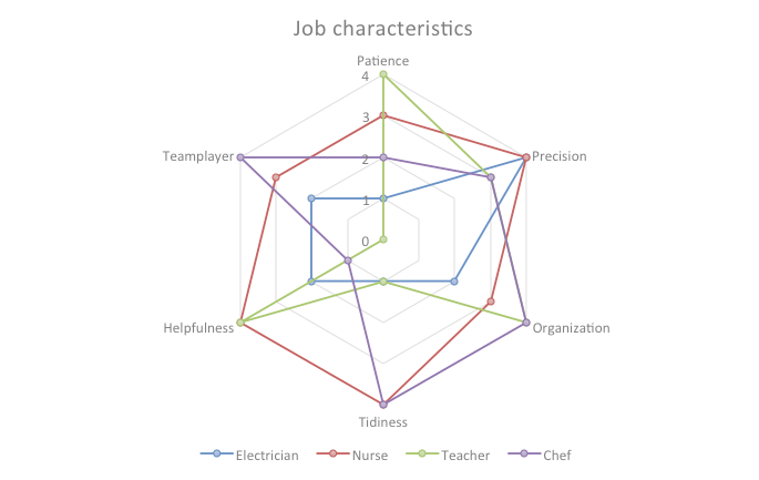
Exercise 1 – Jobs and their characteristics
If you think about your future and you think about the work you would like to do, you can read up on characteristics needed for a certain job. So it is easier to decide what kind of job you would like to do and you might be good at.
The table below contains the opinions collected for a survey by the employment service center.
1 = not important | 2 = needed sometimes | 3 = important | 4 = very important
| Patience | Precision | Organisation | Tidiness | Helpfulness | Teamplayer | |
| Electrician | 1 | 4 | 2 | 1 | 2 | 2 |
| Nurse | 3 | 4 | 3 | 4 | 4 | 3 |
| Teacher | 4 | 3 | 4 | 1 | 4 | 0 |
| Chef | 2 | 3 | 4 | 4 | 1 | 4 |
Step 2: Look at the numbers. What do the numbers tell you?
Step 3: Choose a type of graph for these data. What kind of graph would you choose to represent effectively these data?
Remember the 5 Actions you learned:
Action 1: Open your spread sheet applicationAction 2: First insert the data into a spread sheet
Action 3: Highlight all the data.
Action 4: Insert the chosen graph – click on the right command to insert a graph
Action 5: Insert your title, labels, percentage, different colours…

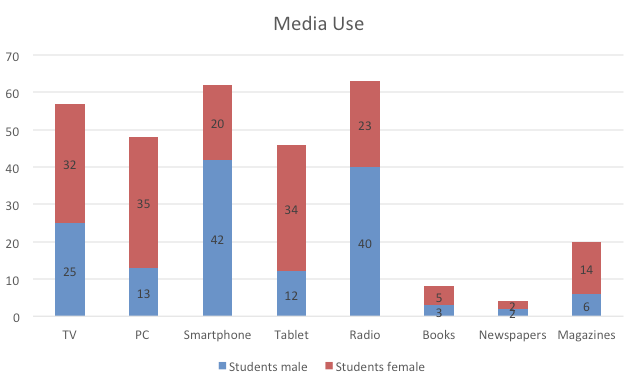
Exercise 3 – Media use
Studies often focus on differences in behaviour depending on your gender. In this study you can read about different ways that students primarily access information.
Here below the table shows the answers of students that have been asked:
Which media do students use to access information?
| Media | Students male | Students female |
| TV | 25 | 32 |
| PC | 13 | 35 |
| Smartphone | 42 | 20 |
| Tablet | 12 | 34 |
| Radio | 40 | 23 |
| Books | 3 | 5 |
| Newspapers | 2 | 2 |
| Magazines | 6 | 14 |
| 143 | 165 |
Step 2: Look at the numbers. What do the numbers tell you?
Step 3: Choose a type of graph for these data. What kind of graph would you choose to represent effectively these data?
Remember the 5 Actions you learned:
Action 1: Open your spread sheet applicationAction 2: First insert the data into a spread sheet
Action 3: Highlight all the data.
Action 4: Insert the chosen graph – click on the right command to insert a graph
Action 5: Insert your title, labels, percentage, different colours…

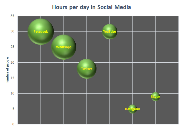
Exercise 4 – Following Social Media
Do you use social media? What kind do you use? And for how many hours per day? In this table you can find the likes of students and average hours per day that they use it.
| social media | Nombre de personnes | Moyenne du nombre d’heure/j |
| 30 | 9 | |
| 25 | 8 | |
| 18 | 5 | |
| youtube | 30 | 3 |
| 5 | 1 | |
| skype | 9 | 1 |
Do you use the following social media and if yes, for how many hours per day on average?
Step 2: Look at the numbers. What do the numbers tell you?
Step 3: Choose a type of graph for these data. What kind of graph would you choose to represent effectively these data?
Remember the 5 Actions you learned:
Action 1: Open your spread sheet applicationAction 2: First insert the data into a spread sheet
Action 3: Highlight all the data.
Action 4: Insert the chosen graph – click on the right command to insert a graph
Action 5: Insert your title, labels, percentage, different colours…

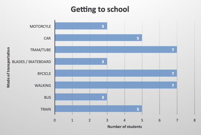
Exercise 5 – How do you get to school?
Students were asked what means of transportation they use to get to school.
How do you get to school? (More than 1 answer is possible)
| Mode of transportation | Number of students |
| Train | IIIII |
| Bus | III |
| Walking | IIIII II |
| Bycicle | IIIII II |
| Blades / Skateboard | III |
| Tram/Tube | IIIII II |
| Car | IIIII |
| Motorcyle | III |
Step 2: Look at the numbers. What do the numbers tell you?
Step 3: Choose a type of graph for these data. What kind of graph would you choose to represent effectively these data?
Remember the 5 Actions you learned:
Action 1: Open your spread sheet applicationAction 2: First insert the data into a spread sheet
Action 3: Highlight all the data.
Action 4: Insert the chosen graph – click on the right command to insert a graph
Action 5: Insert your title, labels, percentage, different colours…


