


Does and Dont’s for creating and interpreting graphs
Before you have a go at interpreting graphs, here some do´s and don´ts.
Does and Dont’s for creating graphs
| DOES | DONT’S |
| State the numbers of people asked | Do not just give a graph or infographics without further information |
| Choose a graph that shows the info you want to emphasize | Do not read predictions as facts! Always say that they are predictions when looking at the data you have as facts |
| As shown in 6.2, a diagram can easily be manipulated – so be careful to use all data to give an overview, then go into detail | Do not use pictures you are not allowed to use! |
| Use labels on the axes. |
Does and Dont’s for interpreting graphs
| DOES | DONT’S |
| Read all numbers and information. | Do not just look at the line or curve and draw a conclusion. |
| When you want to look at trends, be careful always to state, that looking at the facts, you THINK that the development will go in a specific direction | Do not read predictions as facts! Always say that they are predictions when looking at the data you have as facts |
| Test your hypothesis, if they are even possible | Do not take every graph to be true. Bare in mind that the creator wants to tell you something. They might try and manipulate you. |
| Do not just describe the X and Y axis, but give the information (eg: “as you can see the x-axis represents the years of sightings and the y-axis the number of sightings”) | |
| Do not just state what the graph does (eg. “The line went up”) but state what is behind the line (eg: “the number of kestrels dropped slightly in the next 5 years”) | |
| Don’t use shorthand (eg: “mice dropped”) but whole sentences (eg: “The number of mice dropped significantly in the following five summers”). |
Now that you know your Does and Don’t’s let’s give it a try!
Exercises to interpret graphs
How would you interpret the graphs shown below?
What did you learn looking at this graph?
What can you not know?
Use the Steps of the Analysis of the previous chapter.
Analysis 1: Reading basics
Read the labels and the legend of the diagram. What does it visualise?
Analysis 2: Reading important numbers
Read the most important points. Important points are peaks, lows, turning points and intersection points.
Analysis 3: Define trends
Define all significant trends.
Analysis 4: Compare trends
Knowing the trends, compare them, to find out differences and relations.
Are there common trends? Is there a pattern?
Analysis 5: Analyse trends
Establish hypotheses how the data are related. These hypotheses have to be questioned and assessed.
Analysis 6: Predict a development
Based on the development of the diagram and the established hypothesis we can predict future developments of the diagram.
But be careful: Predictions are always only speculations!
Exercise 1: Favourite sports of students
What sport do students, differentiated by gender?
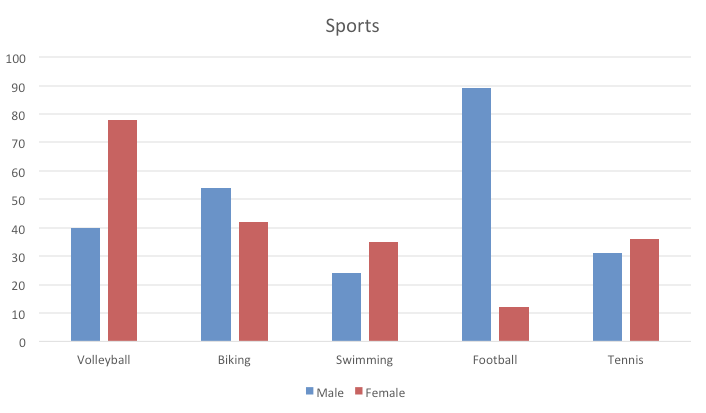
Analysis 1: Reading basics
Read the labels and the legend of the diagram. What does it visualize?
x-Axis: Here you can read what kind of sports have been mentioned in the answers.
y-Axis: Here you can read the numbers. We don’t know, if the axis is in percent or in numbers, because the name of the axis is missing. That should be stated first. If the axis is in percent, we do not know how many people were asked, but if the axis is in numbers, we know the exact number of people who play the sports. We also don’t know, if an asked person gave just one answer or if more answers were allowed.
Blue bar: Answers of male persons.
Red bar: Answers of female persons.
The title states: What sport do students do, differentiated by gender? – We know therefore that only students were asked, but not which school/university etc.
Comparison: We know the favorite sports, if more males or females prefer a sport.
Analysis 2: Reading important numbers
Read the most important points: peaks, lows, turning points, intersection points…
Peaks: Almost 90 males play football. Almost 80 females play volley ball.
Lows: Football is played by the least females. Swimming has the lowest scores for males.
As this is a bar chart there are no turning points and intersection points.
But we can look at most significant differences between the genders: Volleyball and football show a big difference between the genders. Biking and Tennis show a small difference between the genders.
Analysis 3: Define trends
Define all significant trends.
For these students asked there seem to be gender differences: females, prefer volleyball, males like to play football.
Analysis 4: Compare trends
Knowing the trends, compare them, to find out differences and relations. Are there common trends? Is there a pattern?
Is seems that sports that cost little, eg Volleyball and football can be played outside in parks, score high.
Analysis 5: Analyse trends
Establish hypotheses how the data are related. These hypotheses have to be questioned and assessed.
Hypotheses 1: a student does not have much money, so the students that have been interviewed do sports that cost only little money. This could be possible.
Hypotheses 2: maybe there is no swimming pool or tennis court in the village the live in. Therefore less students take time or find a way to travel to these places. This could be possible but we do not know anything about the village they live in. If we knew the village, we could search the internet and find out about the infratucture.
Analysis 6: Predict a development
Based on the development of the diagram and the established hypothesis we can predict future developments of the diagram.
If we stick to hypotheses 1 “students do sports that cost little” we can predict that there will not be a big change in the future unless the community offers other sports possibilities at low costs.
Exercise 2: Revenue and Costs
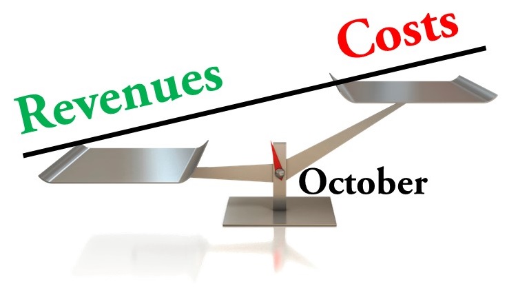
Analysis 1: Reading basics
Read the labels and the legend of the diagram. What does it visualize?
The title states: Revenues and Costs. It is about money coming and money spent.
As you can see, an infographic without numbers can only be used to make a point and to emphasize your outcome.
We know that this graphic is about the month October.
The scale tells us that there is no balance, but that the costs are much higher.
Analysis 2: Reading important numbers
Read the most important points: peaks, lows, turning points, intersection points…
This a very simple graphic: the revenues weigh less than the costs, which means that more money has been spent then gained in October.
Analysis 3: Define trends
Define all significant trends.
As this is just the look at one months, we can not define a trend. We can only state: If there will be more costs than incomes for a longer period, there will be trouble.
Analysis 4: Compare trend
Knowing the trends, compare them, to find out differences and relations. Are there common trends? Is there a pattern?
In our case this is not possible.
Analysis 5: Analyse trends
Establish hypotheses how the data are related. These hypotheses have to be questioned and assessed.
Hypotheses 1: There has been a special event in this months that there have been extraordinary spendings. We do not have sufficient information to prove that.
Hypotheses 2: This person or institution does not know how to handle money. Also for this hypotheses we do not have a proof.
If we could look at the other months of the year or maybe the previous year, we might be able to do an analysis.
Analysis 6: Predict a development
Based on the development of the diagram and the established hypothesis we can predict future developments of the diagram.
If there will be more costs than incomes for a longer period, there will be trouble.
